I help brands communicate better
Governance and Solutions
I ensure projects are expressed properly, beautifully and consistently by providing approvals and solutions across businesses and territories, media and touchpoints.
Brand Guidelines
These can include codifying the rules, reverse engineering design, easy to follow sequential build guides, protocols for how elements move and relate in digital environments, and how brand elements work and where.
Concept and Design
My creative skills cover every stage from concept to delivery. This includes strategy and development, creative design and direction, copywriting, and implementation.
Managing Brand Change
My experience across brand and project building, leadership, and guardianship is extensive and on projects that are variously independent, global and local. I've been a brand project design manager, a team leader and a senior designer. Rollouts? So many...
Brands
- HSBC Staff Channels
- Allianz
- La Trobe University
- Gucci
- Dubai Parks
- Britain Is Great
- Bupa
- Public Transport Victoria
- TalkTalk
- Indian Premier League
- Tesco
- Sure/Rexona
- Carlton United Breweries
- ITV
Agencies
- Beyond
- Bulletproof
- Cheil
- Corkewallis
- DesignWorks
- Engine
- Fold7
- FutureBrand
- Grey London
- IMG
- ITV
- Mother
- Siegel+Gale
- Sunshine
- Tesco
- Turner Duckworth
La Trobe University Melbourne
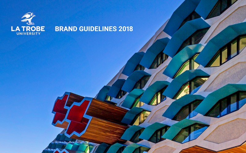
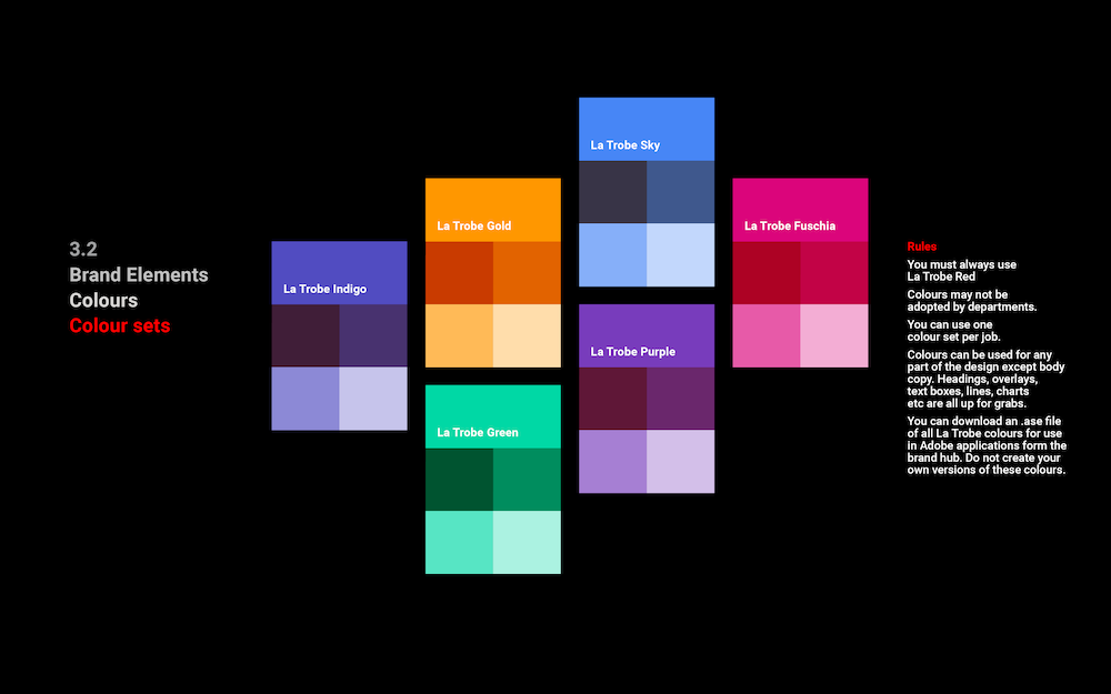
I was brought in to help steer the design and develop the brand system for La Trobe’s rebrand project.
I worked on all aspects - visual, content, and messaging - including logo usage, choosing colours and fonts, and developing flexible layouts.
Client: La Trobe University



Gucci / Chime For Change
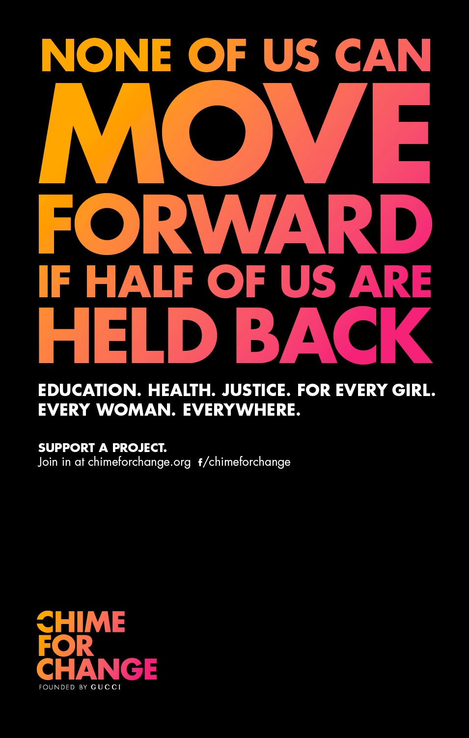
The campaign is designed to raise awareness and benefit women around the globe. I worked on every aspect of the design across print, digital and experiential.
I also developed and wrote the brand guidelines including sequential build guides for all ad formats; messaging content and hierarchy, and the usual colour, logo and type guides.
Client: Mother London




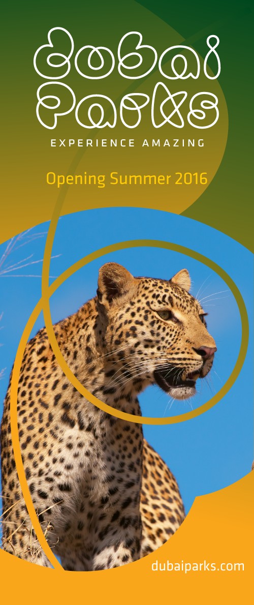
Dubai Parks
This theme park with seven branded areas needed an overriding design system and a look and feel that could adapt to anything. Dubai Parks branding is based around lines and gradients not around a logo.
I developed customer-facing design that is colourful, dynamic, and playful, codified and wrote brand guidelines.
Client: FutureBrand




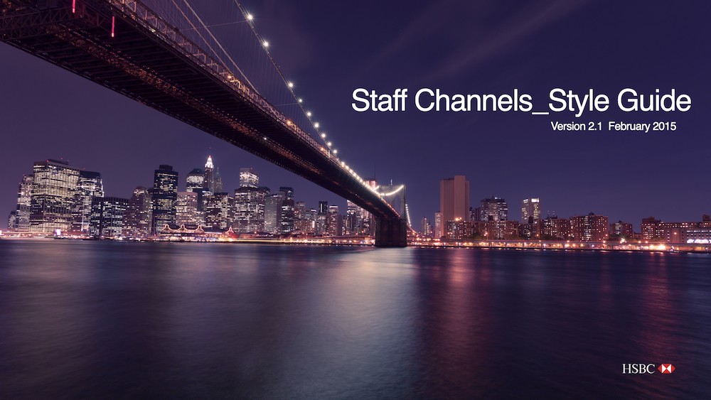
HSBC Staff Channels
I was Design Manager for this global Staff Channels project. I wrote and maintained the guidelines for the system, including technical specifications. I was also responsible for approving the final design and UX elements.
We rebuilt all aspects of the design and the UX of staff interface. I was responsible for several innovations to the HSBC interface: collapsible step tracker, improved on-call indicator, temporal search bar.


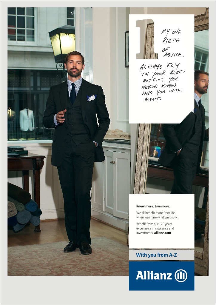
Allianz
I worked on the brand redesign for this global insurance company and its 2000+ subsidiary organisations, producing newsletters, fact sheets, magazines, PowerPoint documents, and logos.
Client: Grey London


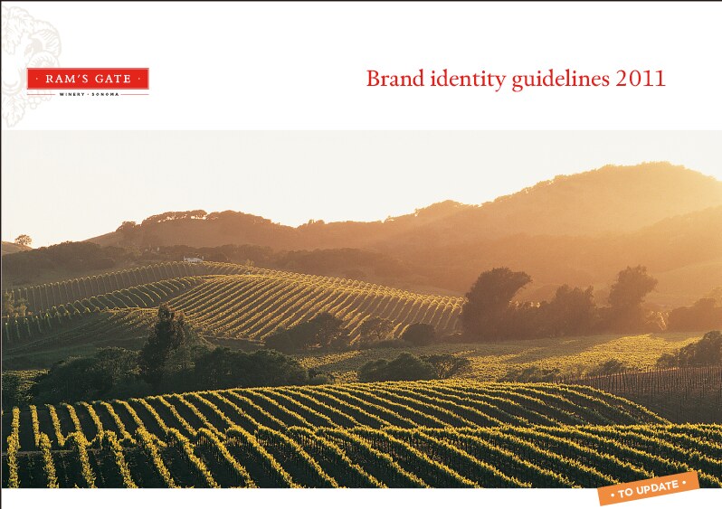
Brand guidelines
As well as writing these brand guidelines I've worked on all of the design for these projects. This is not a complete list.



Bupa Aged Care
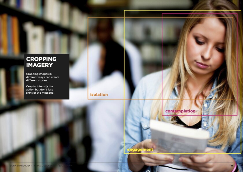
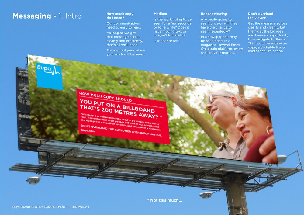
As part of the global brand consolidation I wrote, designed and produced the Visual Brand Elements guide. I also devised a guide for images which demonstrates how cropping an image can suggest different things.
Client: Calling Brands


Rexona / Sure
These brand guides weren't about the design. They were about the idea behind it. They are bold, simple and designed to be read very quickly.
Client: DLKW Lowe


Britain is GREAT
I developed the design and wrote and produced the guidelines for this global campaign. This included creating standardised layouts, typography and content.
I provided worldwide artwork approvals and found solutions for territory specific situations.
Client: Mother London


Samsung
I wrote and produced the European Retail Guidelines for Samsung, covering different store formats and including guides for visual merchandising and messaging.
Client: Cheil


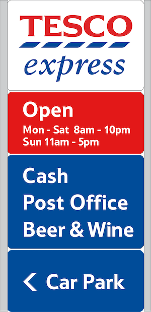
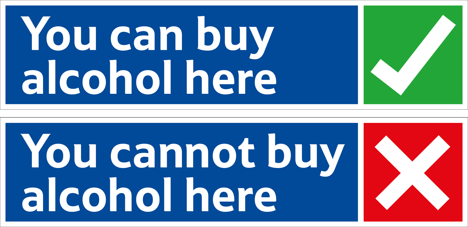
Tesco Property Department
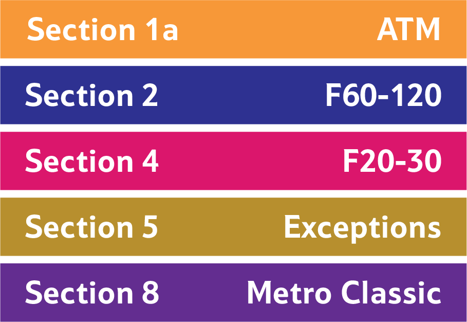
With a small team I rebuilt the store design manual. I designed a modular system that could be extrapolated across the business.
Common assets were used and retail formats were differentiated by colour to allow store design managers to access information easily.
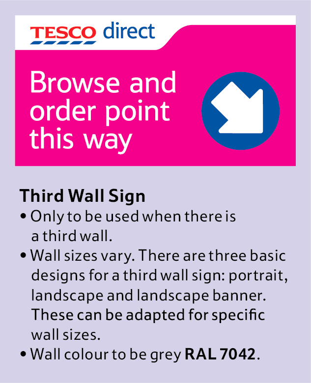
I also designed signage, a modular petrol station gantry, and literature.





Royal George Hotel Kyneton
The concept was ‘this place is as big as a ship’. The client wanted a look that was modern but classic. The colours had to be warm and deep, and complement the ‘wood and walls’ look of the interior.
The result of this is design that’s vaguely nautical. The logotype is custom and influenced by type on ships. There’s also references to cargo stencilling, waves, flags and plimsoll lines.


The Crimean North Melbourne
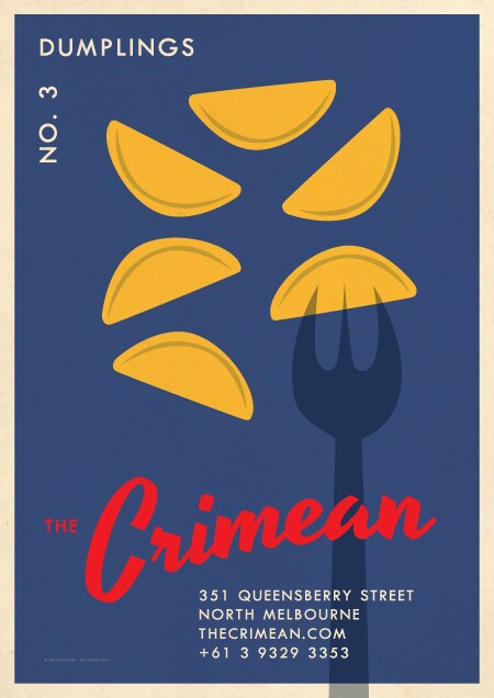
The look for this awarded Eastern European restaurant and bar was based on Czech match box labels from the '60s and '70s. These posters were forever getting stolen from the outside of the building.



Keep Prisons Single Sex
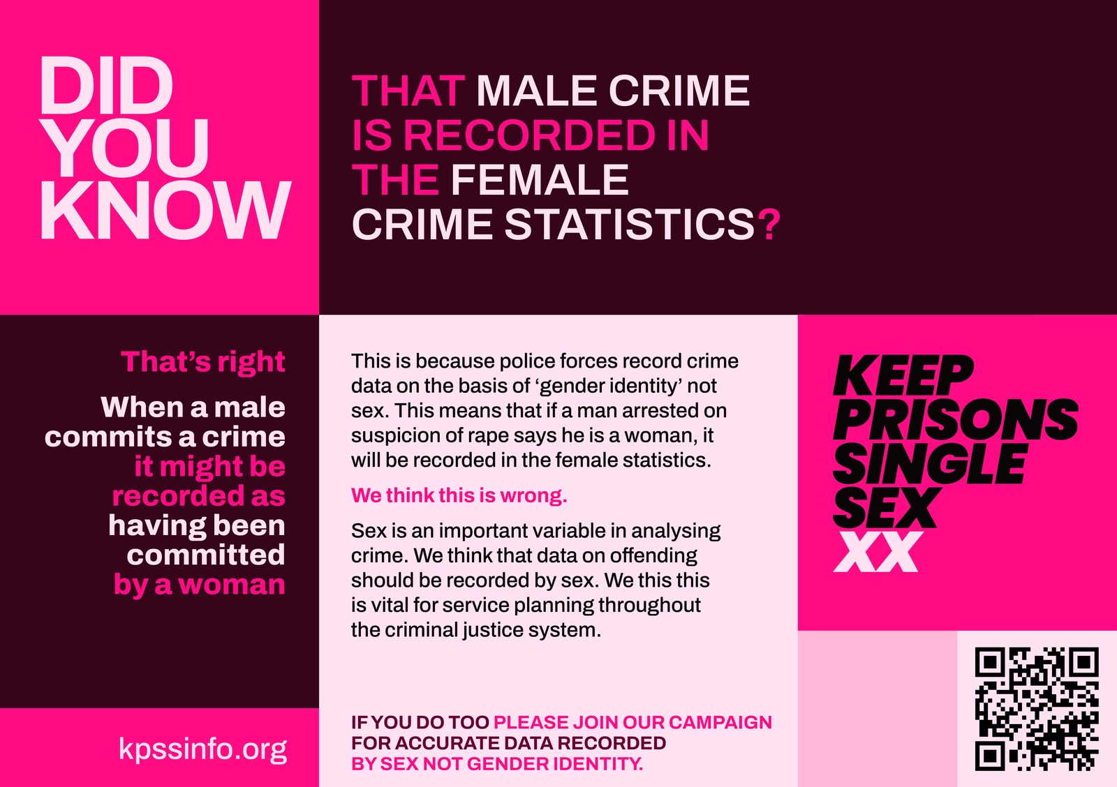
New branding for the prisoners' advocacy group. It is designed to be bold and plain speaking. The colour bars connote CCTV surveillance and prison gates.
The design is intentionally blocky and without images. Impact is the aim. It is designed as an easily editable modular system. Different colourways use tones from the gradient palettes.



Max Inc
This ongoing project involved designing the identity for the shop and lamp, with the rounded star referencing the lamp's adjustment knob.
airBaltic design competition
airBaltic ran a competition to design the livery for its 50th plane. I used an ancient Baltic rune, the Star of Auseklis, as a motif for my design. This was used to unite the design without using the colours of any of the Baltic flags. With simple rules the design can be used on aircraft of any length.

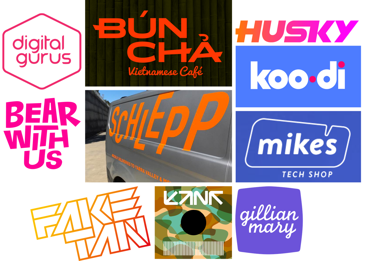
Bespoke letterforms and logos

Hello. I’m an Australian in London and I have three loves: music, design and airline branding. I grew up under a flight path and learned to recognise planes and airlines.
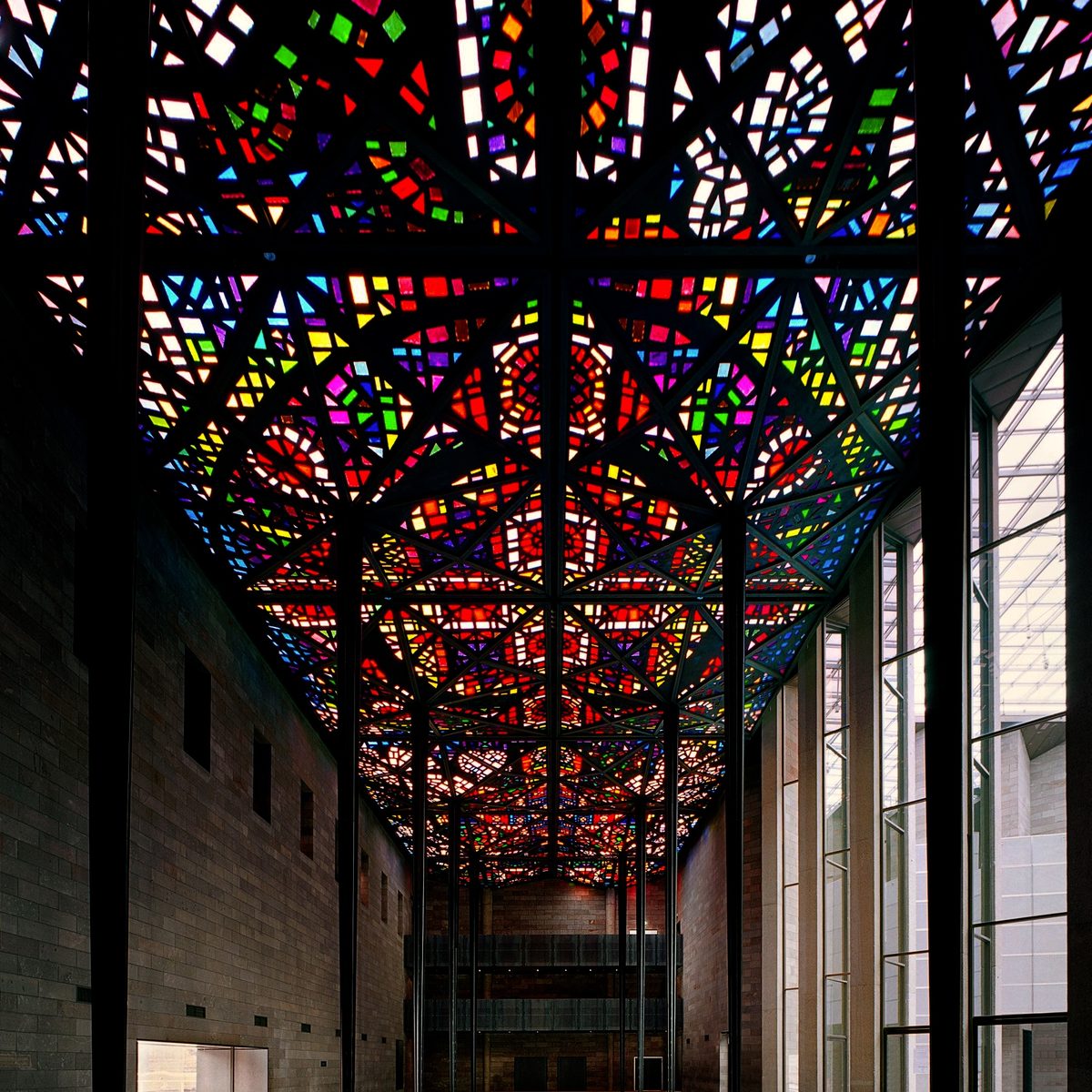
I love vivid colour and transparency. Leonard French’s stained glass ceiling at the National Gallery is an early and enduring influence.
I DJed for 30 years and was a resident at Purveyors in Melbourne, and at Magic Bus at London’s legendary Blue Note. Dancing is freedom. DJing gives me satisfaction. I make music and remix other people’s.
I came to London to work for Acid Jazz Records and was at The Financial Times for a couple of years after. Although I’d been designing things since I was a child it was only after this I went professional, working for Kerrang!, Tesco then agency land.
I was diagnosed with ADHD in 2024; a surprise to no one but me. Now I know why I recognise patterns others may not and understand systems easily. It’s useful in my work. This article talks about how ADHD brains are structured differently.
ADHD means I might miss social cues, interpret situations differently and understand the world differently. I’m grateful to have people around me who understand this.
rTMS and medication have enabled me to break a very long cycle of depression. It feels as though a cloud has finally lifted. Onward!